Looking at the Christmas Numbers
All the elves know: it is mainly about spreading joy. But some numbers need to be kept in check - maybe with bar charts.
Get some code
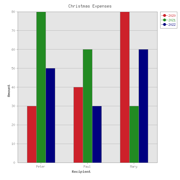
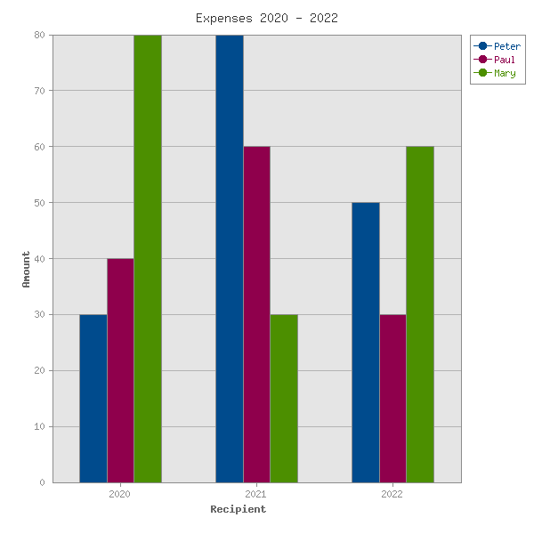
Because they is no time for a long coding session during the jolly season, they just grab some example from Chart::Manual::Types. Every line of it is explained there in detail. Once the code is pasted, they change the first dataset (animal names => gift recipients) and paste into the following sets (rows) the real numbers. At last axis and legend need to be labeled properly and a first draft is ready:
use Chart::Bars;
my $g = Chart::Bars->new( 600, 600 );
$g->add_dataset( qw/ Peter Paul Mary/ );
$g->add_dataset( 30, 40, 80 );
$g->add_dataset( 80, 60, 30 );
$g->add_dataset( 50, 30, 60 );
$g->set(
    title         => 'Christmas Expenses',
    x_label       => 'Recipient',
    y_label       => 'Amount',
    legend_labels => ['2020', '2021', '2022'],
    y_grid_lines  => 'true',
    min_val       =>  0,
    precision     =>  0,
    colors => {
        y_grid_lines => 'gray70',
        misc         => 'gray55',
        text         => 'gray55',
        x_label      => 'gray40',
        y_label      => 'gray40',
        title        => 'gray20',
    },
);
$g->png("bars1.png");
The values under the Hash-key colors just gray out the less important parts, so that the chart is more pleasant.
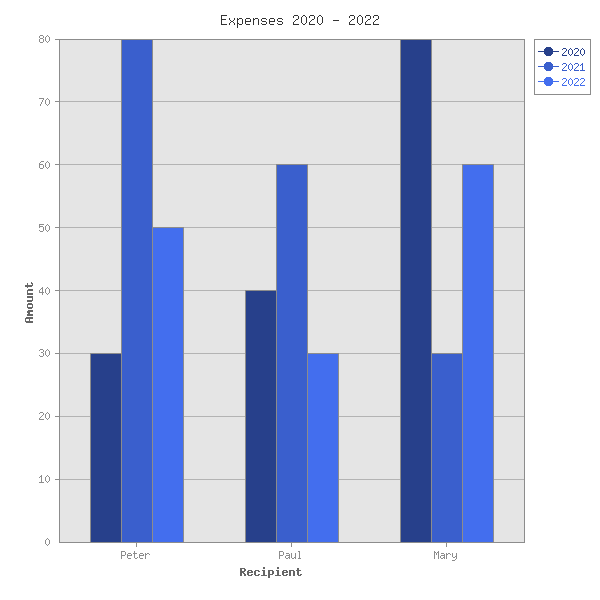
Finding Colors
The only issue now are the dataset colors, which are optimized for contrast (they scream). Intuitive would be to have shades of the same color to signify that neighbouring bars are about the same person, only some numbers are older than others. To achieve that let's pick some appealing color from the table in the lower half of Graphics::Toolkit::Color::Constant. I like 'royalblue3' of the CSS standard. It also has the advantage of providing a workable gradient (list of shades) for free. So just add:
colors => { ...
    dataset0     => 'royalblue4',
    dataset1     => 'royalblue3',
    dataset2     => 'royalblue2',
},
The only counterintuitive part of this code is to understand that the first add_dataset only adds X-axis labels and the following add_dataset is dataset0.
Customize Colors
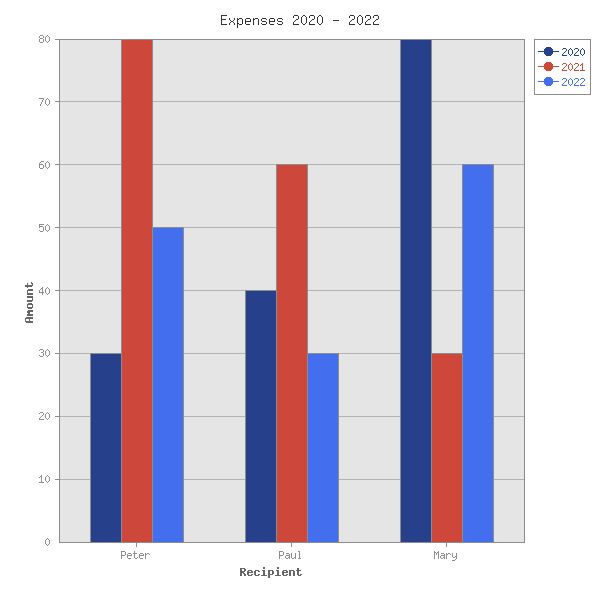
Good, but much of the Christmas business reacts to what was last year. How do we highlight a certain dataset with a more red'ish color, while still keeping saturation and lightness in the targeted scheme of the gradient we had before? For that we load the whole toolkit (a direct dependency of Chart) and import also the helper function color, to keep it all short and sweet.
use Graphics::Toolkit::Color 'color';
...

    colors => { ...
        color('royalblue3')->add( { Hue => -220 } ),
Please make sure to have atleast the version 1.03 installed to use that feature.
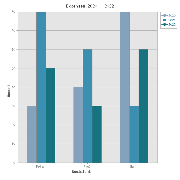
Open the Color Factory
Normal people would be good now, but what would a super picky designer, who just came from the New York Fashion Week say? Maybe something like: how lame - I want a gradient from Glacier Lake to Harbor Blue. Alright - let's check quickly if Graphics::ColorNames::PantoneReport is installed by grep 'ing the result of Graphics::ColorNames::all_schemes and if so, create our own three color gradient with the colors from this summers Pantone Report. (Other standards like X, HTML or VACCC are available too - just look at Bundle::Graphics::ColorNames).
my @gradient = color('PantoneReport:Glacier Lake')
                     ->gradient_to('PantoneReport:Harbor Blue', 3);
 ...
    colors => { ...
        dataset0     => $gradient[0],
        dataset1     => $gradient[1],
        dataset2     => $gradient[2],
If more datasets are present - just increase the second argument of the method gradient_to.
When grouping the values by year instead of recipient, we have to switch X-axis and legend labeling and transpose the data. But also change the colors since they have now to express the difference between people. This does not fit on a linear scale because every human has many different qualities. But the colors still have to go together well to create a harmonious chart. For that task you can create complementary colors, which are maximally different in hue, but same in lightness and saturation (unless the advanced arguments of the method complementary are used).
my @gradient = color('lapisblue')->complementary( 3 );Graphics::Toolkit::Color still holds some more options, but that was enough to get a taste for whats possible.
Conclusion
With Graphics::Toolkit::Color you can quickly color you chart after your liking. Check all example code and images here.
 This article contributed by: lichtkind@cpan.org